Power BI is an excellent data visualization tool but for data exploration Power BI is not a traditional choice. Tools like R and Python are two of the most popular data exploration tools on the market but come with a steep learning curve in order to master syntax and all of the other complexities that come with a programming language. R and Python can create amazing data visualizations but they are not as portable or presentation ready as Power BI.
This post is aimed at those who need to perform data exploration with presentation ready data visuals with no coding required. I will use the Iris data set, from the UCI Machine Learning Repository, to perform single and multi-variable data exploration using summary statistics, histograms, box and whisker, scatter and cluster plots.
I am using the following Power BI Custom Visuals: Clustering, Box and Whisker and Histogram Chart. Instructions on adding custom visuals to Power BI can be found here.
Download and import the Iris data set to Power BI Desktop. Prepare the dataset as follows:
- Rename Column1, Column2, Column3, Column4 and Column5 to Sepal.Length, Sepal.Width, Petal.Length, Petal.Width and Species.
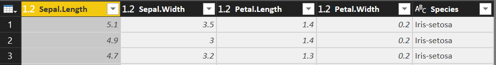
- Add Column, Index Column, From 1. Rename Index to ID.

- Close and Apply.
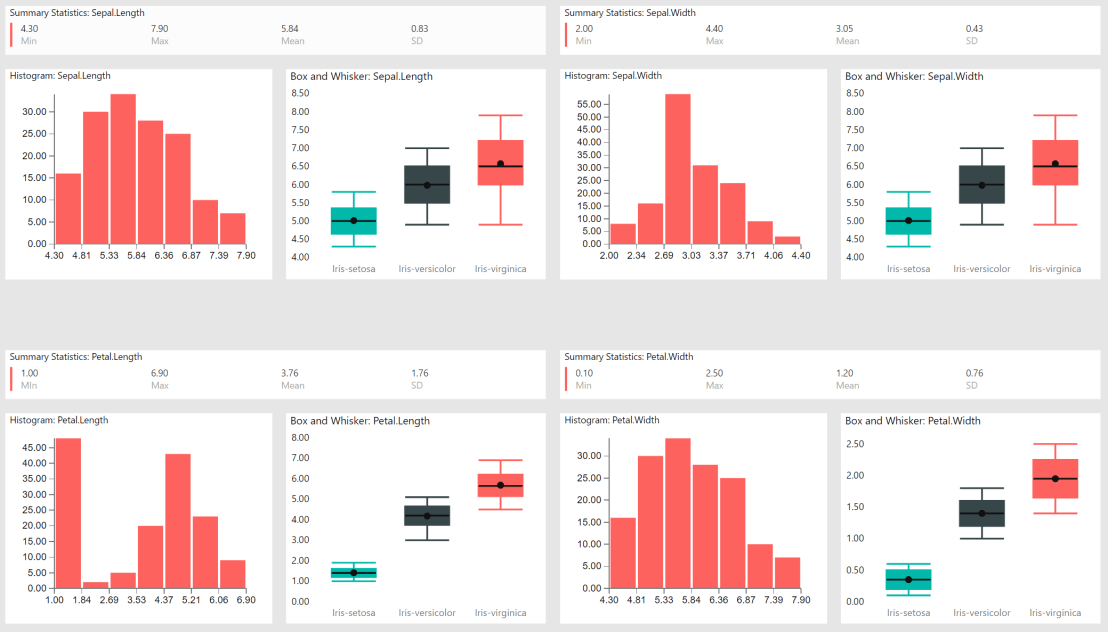
We’ll start single variable data exploration with summary statistics. Summary statistics summarize and provide information about your data. It tells you something about the values in your data set. This includes where the average lies and whether your data is skewed.
Configure a Multi-row card visual as follows:
- Add Sepal.Length to Fields; right click Sepal.Length and change from “Don’t Summarize” to “Minimum”; rename field to Min.

- Add Sepal.Length to Fields; right click Sepal.Length and change from “Don’t Summarize” to “Maximum”; rename field to Max.
- Add Sepal.Length to Fields; right click Sepal.Length and change from “Don’t Summarize” to “Average”; rename field to Mean.
- Add Sepal.Length to Fields; right click Sepal.Length and change from “Don’t Summarize” to “Standard deviation”; rename field to SD.
Once complete your Sepal.Length summary statistics should look like the image below:

Repeat the summary statistics steps for Sepal.Width, Petal.Length and Petal.Width.
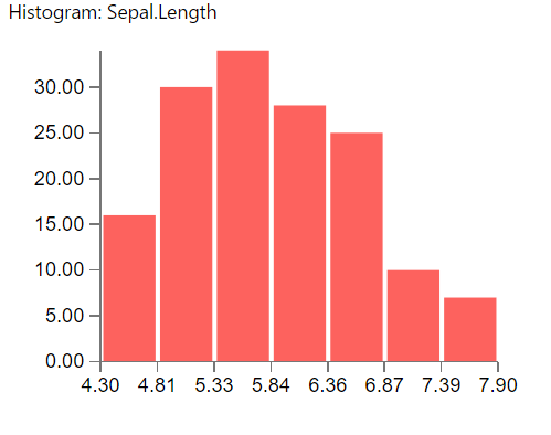
We continue single variable data exploration with the histogram plot. Histograms show the frequency and distribution (shape) of continuous data. This allows the inspection of the data for its underlying distribution (e.g., normal distribution), outliers, skewness, etc.
Configure a Histogram visual as follows:
- Add Sepal.Length to Fields; add Sepal.Length to Frequency; right click Sepal.Length and change from “Sum” to “Count”.

- Once complete your Sepal.Length histogram should look like the image below:
Repeat the histogram steps for Sepal.Width, Petal.Length and Petal.Width.
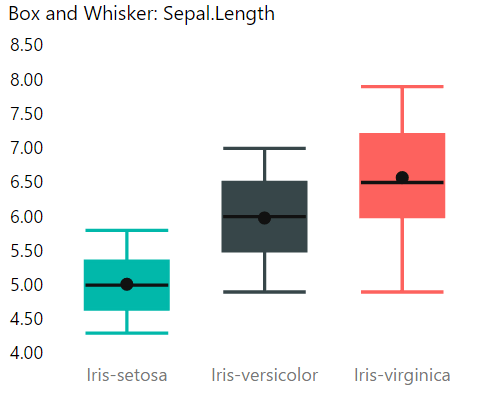
The final single variable data visualization is the box and whisker chart. Box and whisker is useful for indicating whether a distribution is skewed and whether there are potential unusual observations (outliers) in the data set.
Configure a Box and Whisker visual as follows:
- Add Species to Category; add Sepal.Length to Sampling and Sepal.Length to Values; right click Sepal.Length and change from “Sum” to “Median”.

- Once complete your Sepal.Length box and whisker chart should look like the image below:
Repeat the box and whisker chart steps for Sepal.Width, Petal.Length and Petal.Width.
My single variable data exploration report tab looks like this:
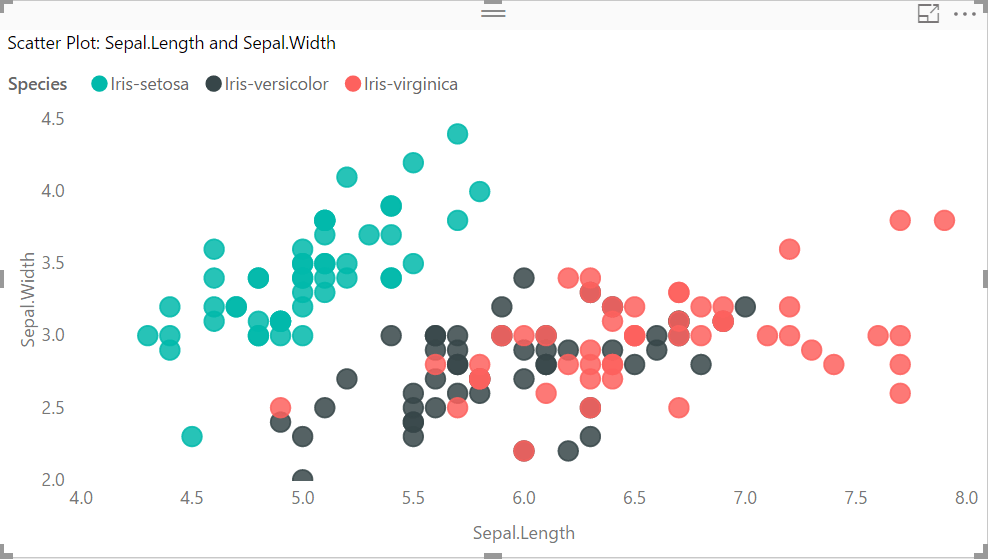
For multiple variable data exploration we’ll start with a scatter plot. Scatter plots show how much one variable is affected by another.
Configure a Scatter chart visual as follows:
- Add Id to Details; add Species to Legend; add Sepal.Length to X Axis; add Sepal.Width to Y Axis.

- Once complete your Scatter Plot should look like the image below:
Repeat the scatter plot steps for Petal.Length and Petal.Width.
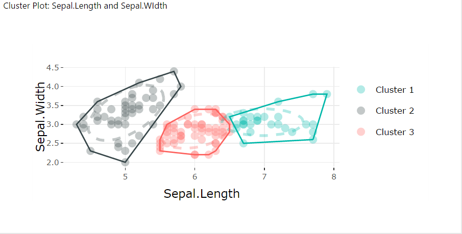
We’ll use Clustering for our final multi variable data visualization. Clustering helps to find groups in the data by grouping data points on feature similarity.
Configure a Clustering visual as follows:
- Add Sepal.Length and Sepal.Width to Values; add Species to Data Point Labels.

- Modify the Formatting of the Clustering data visualization as follows:
- Visual appearance of clustering; Draw ellipse “On”; Draw convex hull “On”.

- Visual appearance of clustering; Draw ellipse “On”; Draw convex hull “On”.
- Once complete your Clustering should look like the image below:
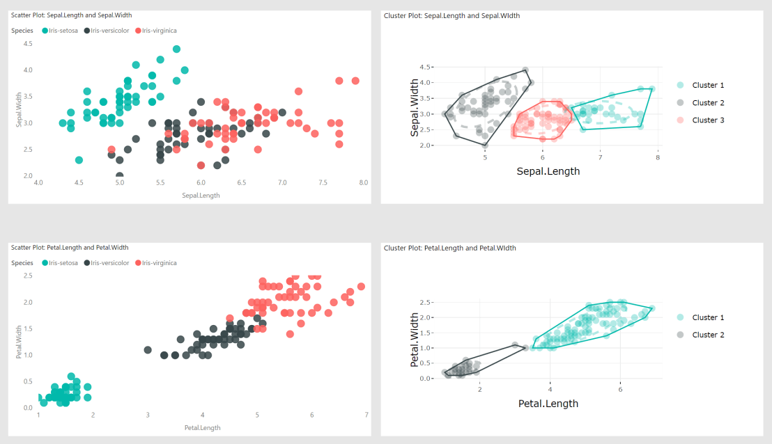
- Repeat the clustering plot steps for Petal.Length and Petal.Width.My multi variable data exploration report tab looks like this:
To reiterate, Power BI is not the traditional choice for data exploration but for presentation ready data visuals with no coding required it fills a legitimate need for some end users.
Thanks for stopping by.
NY
