Microsoft recently announced Enhanced Quick Edit for SharePoint lists and libraries features. These value-added updates go along way in modernizing the look and functionality of SharePoint lists. In this blog post I will try to showcase the Quick Edit updates with a list design that can be used for tracking enhancements. This is a no-low code approach to solution development.
Part 1 – List Build
My list definition is listed below:
| Title | Single line of text |
| Feature | Choice |
| Enhancement Type | Choice |
| Priority | Choice |
| Status | Choice |
| Date Started | Date and Time |
| Date Completed | Date and Time |
| Target Date | Date and Time |
| Release Date | Date and Time |
| % Complete | Number |
| Accountable | Person or Group |
| Effort (Hours) | Number |
| Description | Multiple lines of text |
| Functional Approver | Person or Group |
| Technical Approver | Person or Group |

The base list is shown below.

I’ll use the “out of the box” Format column feature on the “Priority” column to assign different background colors to help differentiate High, Medium and Low priority items.
- Click the down arrow on the “Priority” column, select “Column settings” and click “Format this column”.
- Select the “Fill background color” option.


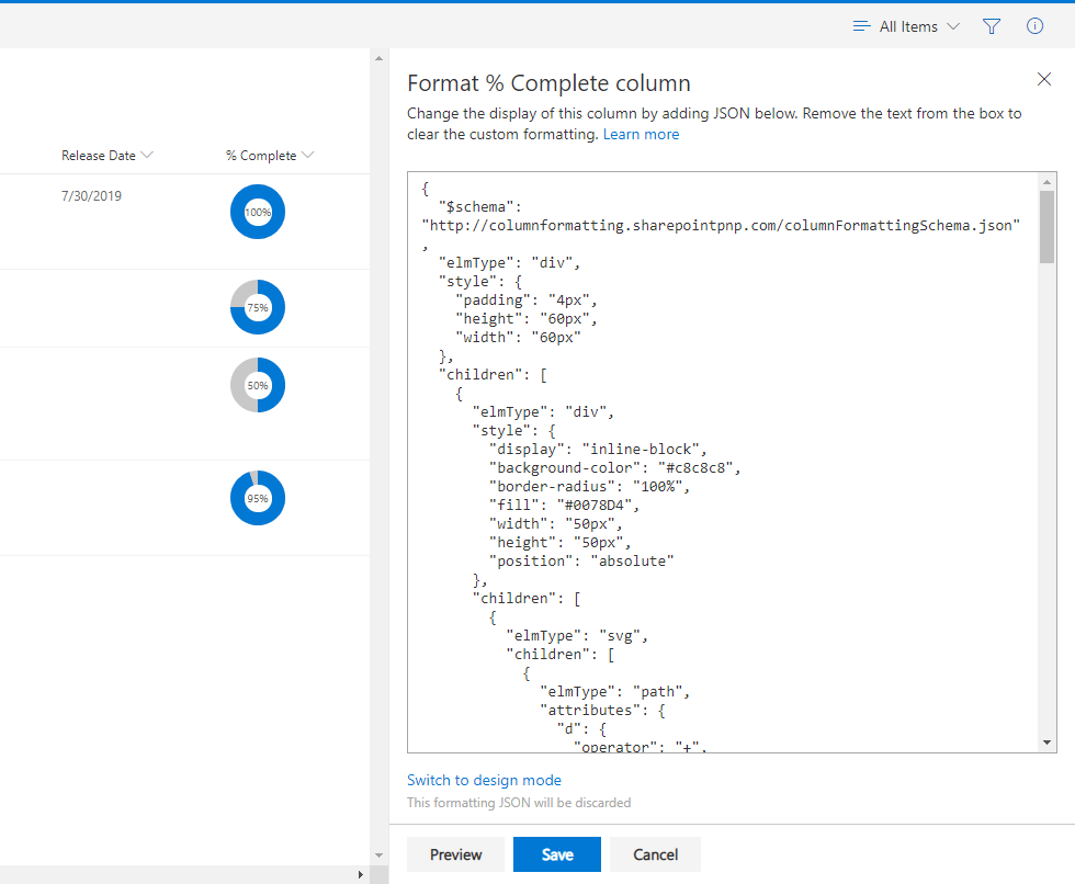
I’ll use JSON code to format the “% Complete” column to look like a donut chart.
- Click the down arrow on the “% Complete” column, select “Column settings” and click “Format this column”.
- Paste the following JSON code into the format column window and click “Save”.
{
  "$schema": "http://columnformatting.sharepointpnp.com/columnFormattingSchema.json",
  "elmType": "div",
  "style": {
    "padding": "4px",
    "height": "60px",
    "width": "60px"
  },
  "children": [
    {
      "elmType": "div",
      "style": {
        "display": "inline-block",
        "background-color": "#c8c8c8",
        "border-radius": "100%",
        "fill": "#0078D4",
        "width": "50px",
        "height": "50px",
        "position": "absolute"
      },
      "children": [
        {
          "elmType": "svg",
          "children": [
            {
              "elmType": "path",
              "attributes": {
                "d": {
                  "operator": "+",
                  "operands": [
                    "M25,25 L25,0, A25,25 0 ",
                    {
                      "operator": ":",
                      "operands": [
                        {
                          "operator": "=",
                                                      "operands": [
                                                        "@currentField",
                                                        100
                                                      ]
                                                    },
                                                    99.9999,
                                                    {
                                                      "operator": "?",
                                                      "operands": [
                                                        {
                                                          "operator": "=",
                                                      "operands": [
                                                        "@currentField",
                                                        100
                                                      ]
                                                    },
                                                    99.9999,
                                                    {
                                                      "operator": "?",
                                                      "operands": [
                                                        {
                                                          "operator": "<",
                                                          "operands": [
                                                            "@currentField",
                                                            0
                                                          ]
                                                        },
                                                        0,
                                                        "@currentField"
                                                      ]
                                                    }
                                                  ]
                                                },
                                                0
                                              ]
                                            },
                                            100
                                          ]
                                        }
                                      ]
                                    }
                                  ]
                                },
                                25
                              ]
                            }
                          ]
                        }
                      ]
                    },
                    " z"
                  ]
                }
              }
            }
          ]
        }
      ]
    },
    {
      "elmType": "div",
      "style": {
        "background-color": "white",
        "position": "relative",
        "width": "25px",
        "height": "25px",
        "top": "0px",
        "left": "12.5px",
        "border-radius": "100%",
        "text-align": "center"
      },
      "children": [
        {
          "elmType": "div",
          "txtContent": {
            "operator": "+",
            "operands": [
              "@currentField",
              "%"
            ]
          },
          "style": {
            "position": "relative",
            "text-align": "center",
            "width": "50px",
            "display": "inline",
            "line-height": "25px",
            "font-size": "10px"
          }
        }
      ]
    }
  ]
}
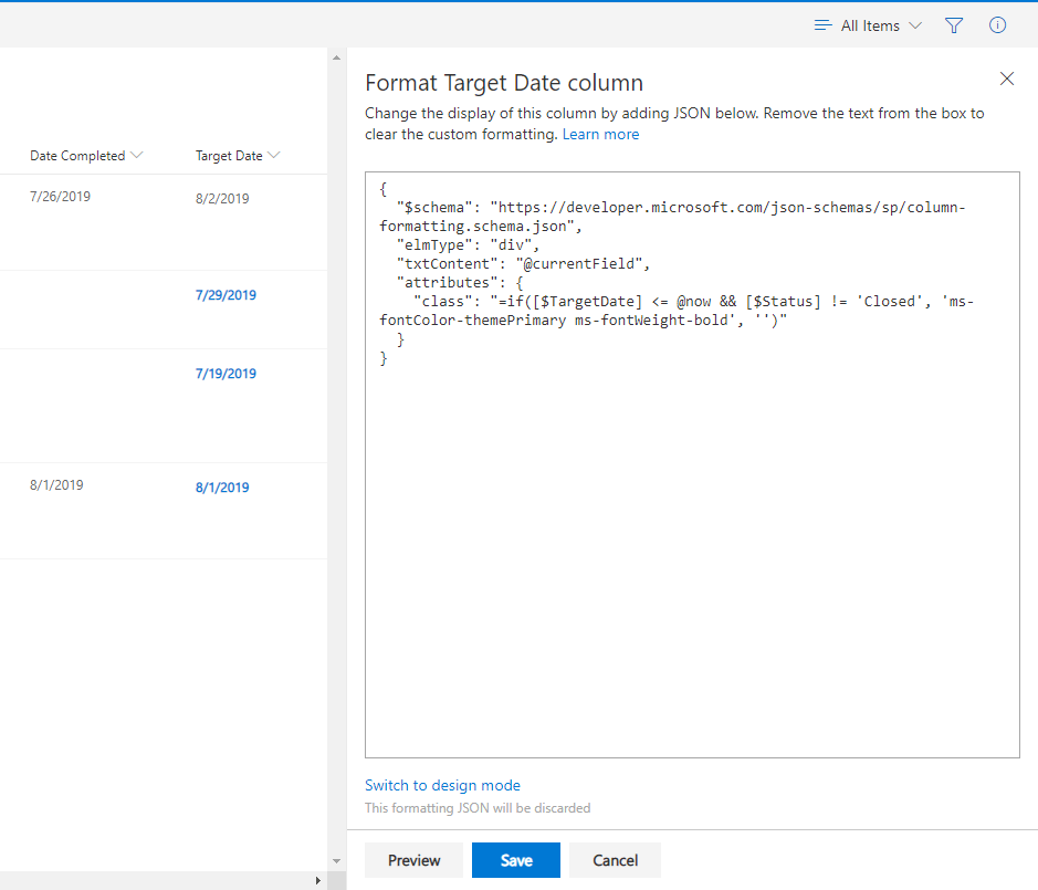
I’ll use more JSON code to highlight items that have missed their “Target Date”.
- Click the down arrow on the “Target Date” column, select “Column settings” and click “Format this column”.
- Paste the following JSON code into the format column window and click “Save”.
{
"$schema": "https://developer.microsoft.com/json-schemas/sp/column-formatting.schema.json",
"elmType": "div",
"txtContent": "@currentField",
"attributes": {
"class": "=if([$TargetDate] <= @now && [$Status] != 'Closed', 'ms-fontColor-themePrimary ms-fontWeight-bold', '')"
}
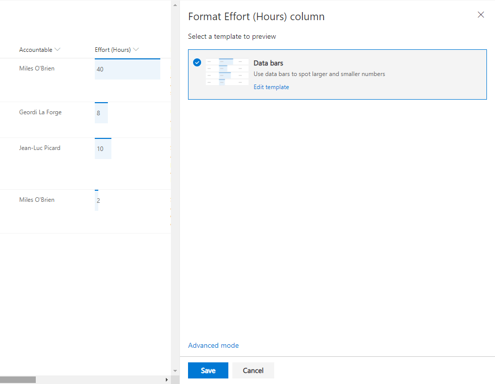
}I’ll format the “Effort (Hours)” column to visually show comparative effort.
- Click the down arrow on the “Effort (Hours)” column, select “Column settings” and click “Format this column”.
- Select the “Data bars” option and click “Save”.
Part 2 – Quick Edit Features
Filters Pane is now available in Quick Edit Mode
“Users can filter their content in Quick Edit mode to locate the items for updates. In addition, any filters or sorting applied in Quick Edit will persist as the user navigates back to the normal view.”
Before image with Filter pane open and filters selected.

After image with Filter pane closed and filters persisting.
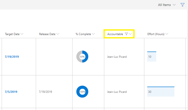
All formatting appears in Quick Edit
“Any custom formatting for the list or document library will now also render in Quick Edit.”

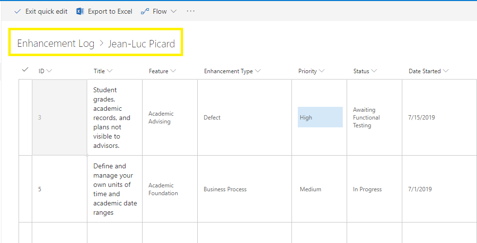
Breadcrumb
“Just as in normal list and document library views, the breadcrumb will now appear in Quick Edit. This gives you a visual clue about applied filters and a simple way to navigate “back” to larger data sets.”
Adjust and save column widths
“Users can now define their preferred column widths by dragging and dropping directly within Quick Edit. In addition, any previously save column widths (either in the view or in local storage) will persist for users when they navigate to Quick Edit.”
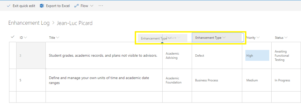
Drag and drop columns
“Easily re-order your columns within Quick Edit by dragging and dropping.”
Enhanced people picker
“You can now browse and selected users from your organization directory efficiently with our new people picker.”

Thanks for stopping by.
Norm
 Norm Young