Microsoft is rolling out a new Power Platform integration for Microsoft Lists called Visualize the list. This latest addition creates an auto-generated Power BI report based on the underlying list schema. The auto-generated report provides an excellent starting point for users not proficient with Power BI. In this blog post I will show how to get started with Visualize the list and offer some Power BI tips as I go along. For the purposes of this article I will be referencing an updated version of the Issue tracker template.
Getting started
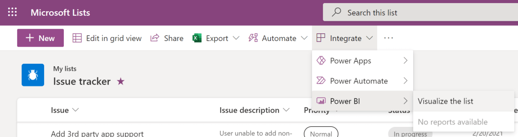
To create the auto-generated report, click Integrate > Power BI > and then select Visualize the list.
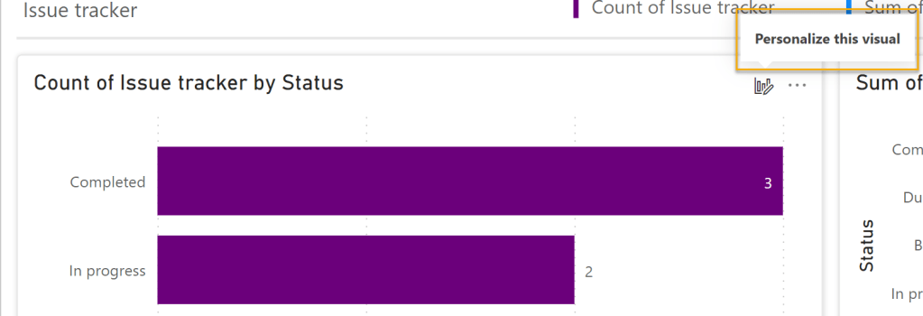
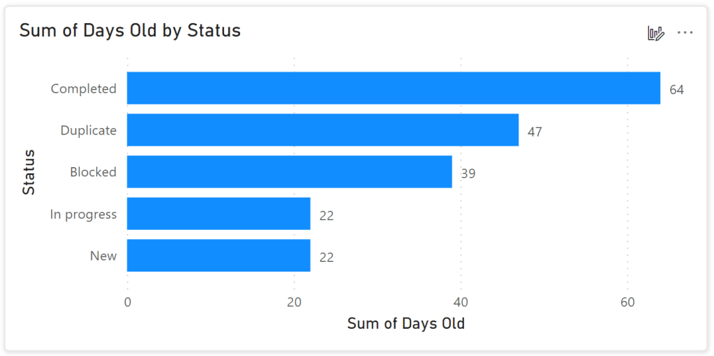
Our initial report is shown in the image below. Power BI has created two measures for use within the report:
- Count of rows (A) is a default measure that is included with all auto-generated reports.
- Days Old (B) is a number column and is automatically converted to a sum measure. Any number columns would be given the same treatment by Power BI.
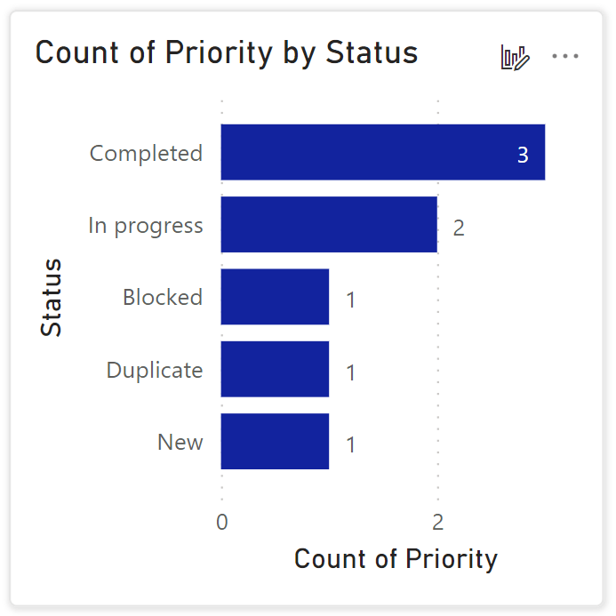
- Choice columns like Priority and Status (C) are included as counts in the Quick summary section and provide different perspectives on the same data.
- Date columns like Date reported (D) and Due Date are automatically converted into a date hierarchy where report users can group, filter and drill up or down from Year > Quarter > Month > Day.

The initial report is highly interactive and can be dynamically updated by selecting any of the measures and attributes listed in the Your data pane. As an example, if I am more interested in Count of rows and not Days Old I would simply select Count of rows and de-select Days Old. The “Sum of Days Old by Status” changes to “Count of Issue tracker by Status”.

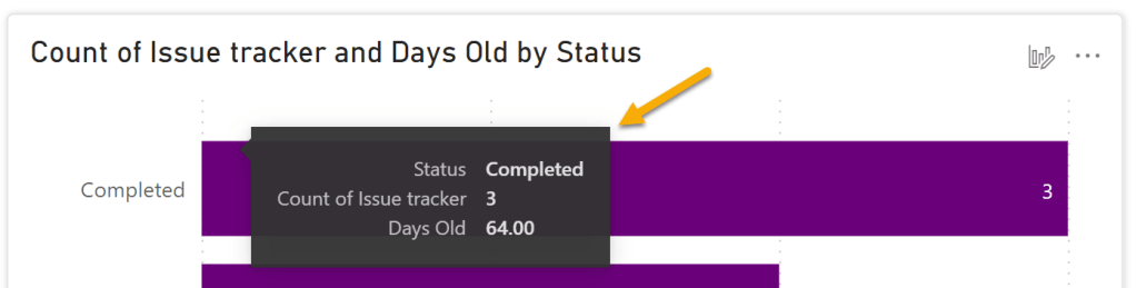
Add Tooltips
You can add more contextual information to the data visualizations by adding Tooltips. Tooltips are supplemental measures that display on mouse hover. To do so:
- Click Personalize this visual.
- Click Add a new field under Tooltips.
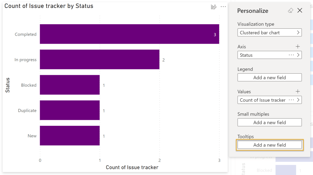
- Select your desired measure. In my case I am adding Days Old.
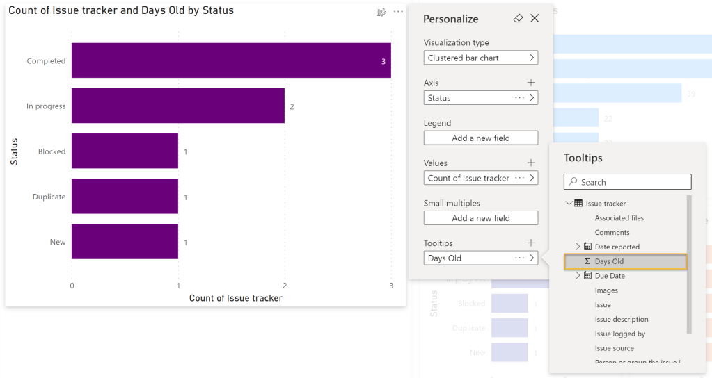
When I hover over the values shown in my updated chart I see the Days Old measure added to the tooltip. When used conservatively this is a great way to add value to the report experience.
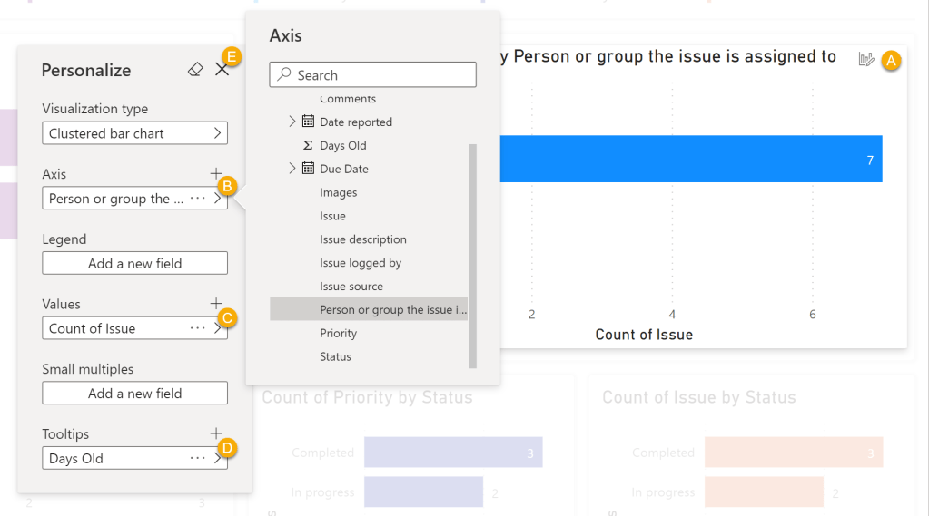
Modify Attributes
You can modify the attributes of an existing data visualization to help tell the story of your data. In the sample image below, I want to change the visual to see how many issue are assigned to each person.
- Click Personalize this visual (A).
- Change Axis to Person or group the issue is assigned to (B).
- Change Values to Issue (C). This will automatically convert to a count measure.
- Add Days Old (D) as a Tooltips.
- Click X (E) to exit.
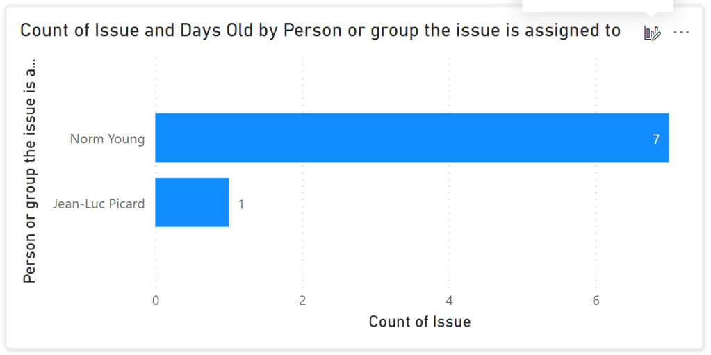
The updated data visualization is shown in the image below.
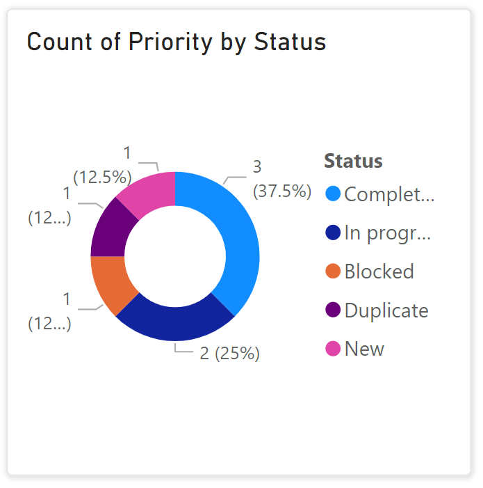
You can modify an existing data visualization type to make the information more consumable by the viewers. In the sample image below, I want to change the visual from a clustered bar chat to a donut chart.
- Click Personalize this visual (A).

The updated data visualization is shown in the image below.
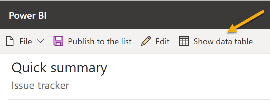
Show Data Table
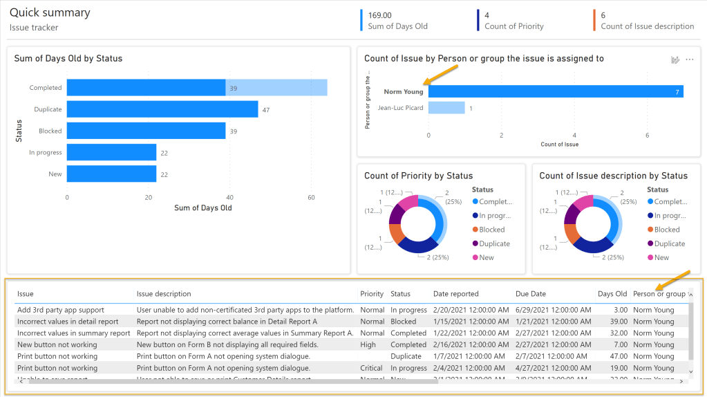
As good as data visualizations are sometimes its nice to have a tabular listing of the data to view the complete details. In the Visualize the list click the Show data table button and the data table is shown on the bottom of the report canvas.
The nice thing about Power BI reports is the dynamic cross-filtering that occurs when you interact with the values in the data visualizations. In the image below I have click on my name and the rest of the report has filtered to show only my values.
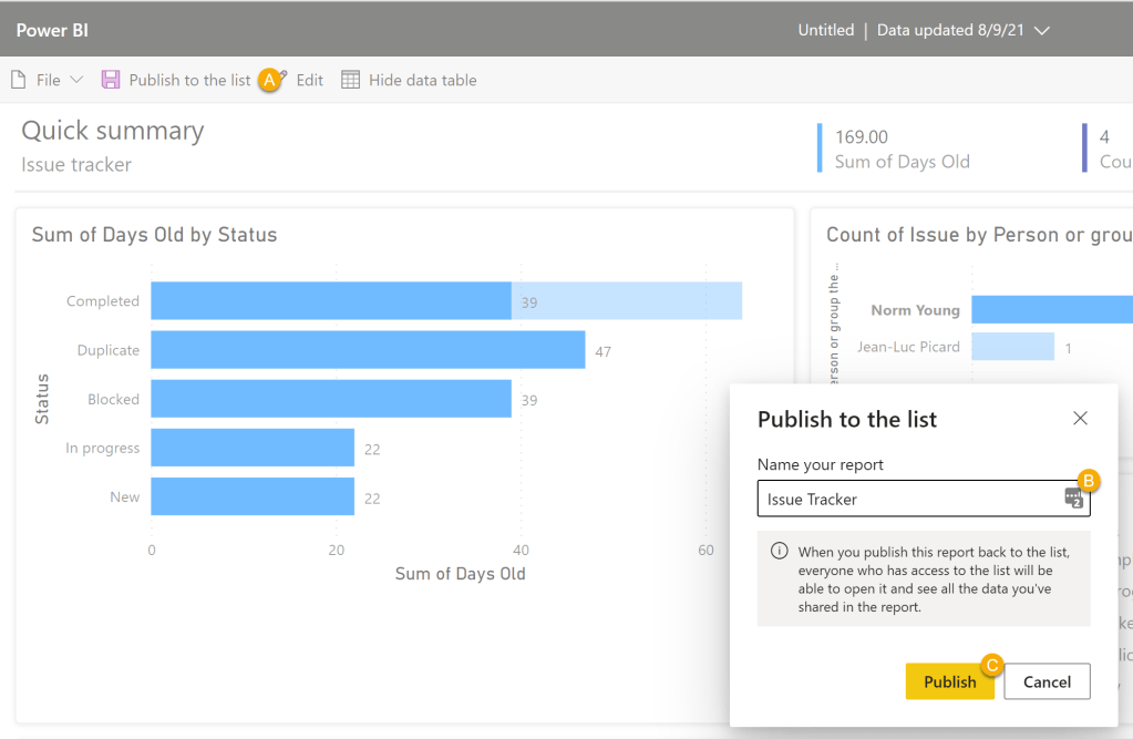
Publish to the list
Once you have finished customizing the default report you can save and publish it to the list for quick access. To do so:
- Click Publish to list.
- Provide a name. I.e. Issue Tracker.
- Click Publish.
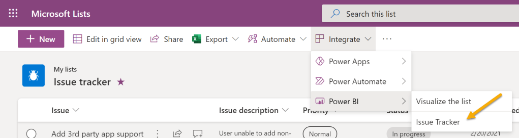
Our report is now available from the Microsoft Lists Integrate menu under Power BI. The report will render in Power BI.
Summary
The Visualize this list feature is a great way to build a “starter” report, especially for those without Power BI experience or with simple reporting needs. If you are familiar with Power BI Desktop you will find the experience quite familiar. I do wish there were more data formatting features for column types like dates. Be sure to try this feature with your lists, you might be surprised by the insights that it provides and the further analytic questions that it raises.
Thanks for reading!
NY

This is cool – thanks for sharing!
LikeLike
Thanks Josh!!!
Norm
LikeLike
This is a great overview! Do you know if there is a way to save a page created in this way as a pbix file?
LikeLike
Hi Jim,
Thanks for those nice words. As far as I know, it is not supported with the Visualize this list feature. I tried this with the Power BI web-part in SharePoint and it did not work.
Thanks for reading!
NY
LikeLike
Here’s a quick question – If I’ve a column with multiple choice, and I want to Individually report out the choices. Power BI doesn’t inherently support column reporting aggregation on comma separated values – How can I do that Power BI?
Example,
A Task list with, a multi-select product column can have a Single Product (ex: A) or Multiple Products (Ex: A, B,C)
If just want to see the count of tasks against Product A, How can I do that?
Another Example:
A Task list, with 1 or more people assigned as stakeholders to it. How can we report in Power BI, tasks assigned per resource.
Task | People
Task 1 – P1, P2, P3
Task 2 – P1
Task 3 – P2
Task 4 – P2, P3
P1 is working on 2 Tasks
P2 is working on 3 Tasks
P3 is working on 2 Tasks
Responses appreciated.
LikeLike
Hi Gagan,
Check out this blog post from John White: https://whitepages.unlimitedviz.com/2018/01/using-power-bi-to-report-on-multi-value-sharepoint-fields/.
I hope this helps and thanks for reading!
NY
LikeLike
Hi Norm, thank you for the post. I used to be able to visualize the list but today, when I click on “visualize the list” I get redirected to the Microsoft site. Do you know if this feature was removed? Thank you
LikeLike
Hi Olga,
I suspect that you where using a Power BI Pro trial license. Get a full license and it should work.
Thanks for reading!
NY
LikeLike
Hi Norm, I’m on E5 and Power BI PRO with the add-on PPU. No trial.
I’ve opened a case with Microsoft. Thank you for responding!
LikeLike
Hi, I’m using “visual the list” feature. There are data from my “Owner” column (Person or Group) SP list but when I created the Power BI quick report, my owner field is blank. Will you be able to advise what’s the issue?
LikeLike
Hi Sharen,
Complex column types like a Person column are not being handled correctly. I though this would have been fixed by now. I’ll msg the product team and let them know its not working.
Thanks for reading!
NY
LikeLike
Hello, I can not find how to remove a report already published, I can only modify it. Do you know how to delete a previous power bi report from a microsoft list ?
Thank you
LikeLike
Hi Emma,
If you go into the report by way of the list you should see a Delete button that will remove the report.
Thanks for reading!
NY
LikeLike